Brands, logo design and the psychology of colour
Well designed logos are clearly recognisable in any colour and can even function in simple black and white, however there is strong evidence to suggest that colour has a huge influence on brand recognition - most likely because it’s the first thing that a potential customer notices. So colour can influence how customers remember your brand and it’s true that they prefer brands they recognise. But that isn’t the only factor to think about. Colours are also linked to emotions and they have cultural associations. Strategic decisions about a brand’s colour always start with considering the brand’s audience and how you want them to perceive your brand.
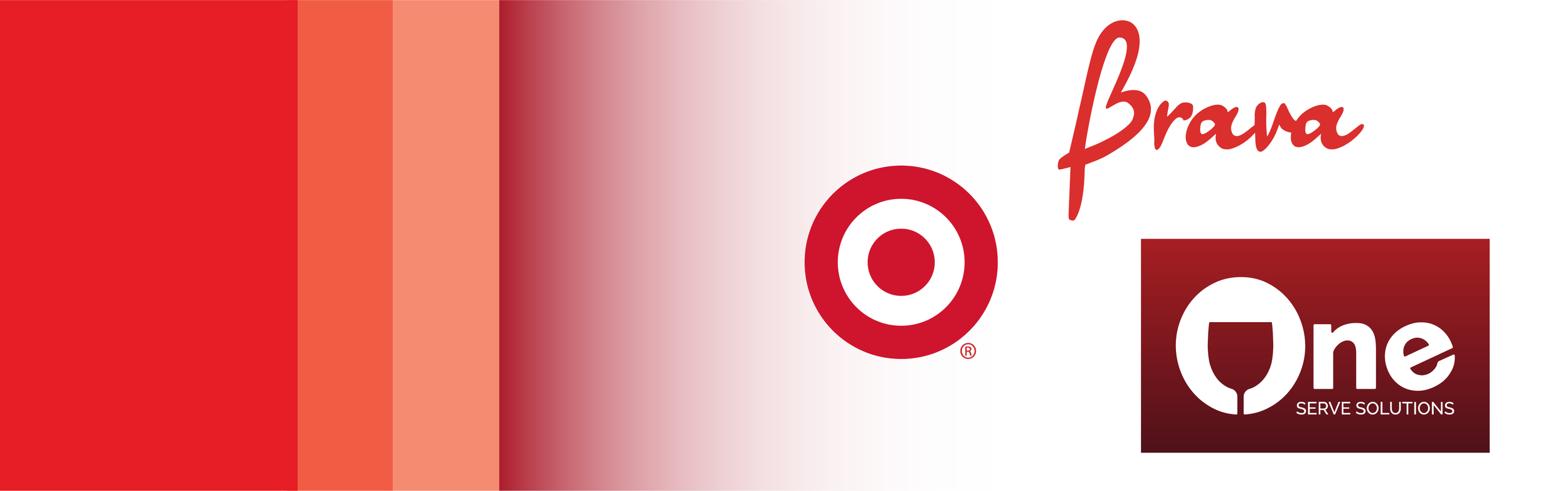
Here you can see some descriptions of colours, the feelings they evoke and the psychological associations they have. Along with each colour there are three examples of brands designed in those colours (one well known brand and two from Blade Creative’s portfolio).
Yellow communicates hope and optimism. It stimulates creativity and energy and its brightness catches the eye.

Orange combines the brightness and cheer of yellow with the energy and boldness of red to make a colour that is full of life and excitement.

Red is a passionate colour, it can increase the heart rate and create excitement. It’s also associated with aggression and power.
Purple is mysterious, sophisticated and elegant colour. It’s been used throughout history to symbolise royalty.

Pink is a feminine and affectionate colour that has been identified with products and services geared towards women and young girls.

Blue is the most commonly used colour for brands, it’s said to put people at ease because it relates to the sky and the ocean.

Green is linked to calm, freshness and health. Deep greens can indicate affluence and lighter shades symbolise serenity.

Brown represents reliability and solidity. It’s commonly used for agriculture, construction and businesses associated with nature.

Black is all about classiness and sophistication. It works particularly well for brands wishing to evoke timelessness, simplicity and prestige.

Gold represents luxury, elegance, prestige and affluence. It’s also used to represent religion, spirituality and royalty.

Grey and silver are related to balance, simplicity, innovation and science. They’re often used by technology brands.

Multi-coloured brands indicate diversity, fun and excitement. They want to make sure they stand out from the crowd.

Colours possess a remarkable ability to influence our perceptions and emotions. They play a significant role in shaping our experiences and can evoke a wide range of feelings, from joy and excitement to serenity and tranquility.Strategic decisions about a brand’s colour always start with considering your audience and how you want them to perceive your brand and when you work with me I’ll encourage you to do this as part of a strategic approach to your brand’s identity. But for small business owners it’s also important for you to really like your brand and feel like it represents you, so we’ll talk about your favourite colour and whether it works for your brand.