What makes a great food packaging design?
Great food packaging design attracts attention, communicates information and creates a positive brand impression. As a food packaging designer it’s my job is to make sure your product’s packaging does all these things.
Your average grocery shopper has a limited list of products in their head that they know and trust – probably around 50 brands. And that means they’ll automatically pick up a product for one reason only - just because they always buy it. Any new product in the market has to work hard to break through the autopilot and the breakthrough starts with the packaging.
So, first and foremost it’s all about appealing visuals. You’ll want your product to stand out on the shelf and that can be through eye catching colours, high quality images and unique typography. Humble Jumble’s packaging, shown here, stands out with its whimsical, and fun imagery and its quirky product names.
Humble Jumble - fun and whimsical
Communicating clear and concise information is just as important as first impressions. Consumers need to be able to quickly understand what a product is and why they should buy it. Packaging should clearly communicate the product name, brand, ingredients and key selling points. Don’t overcomplicate your messaging, you can’t be all things to all consumers, you’ll just end up diluting your message. Ideally choose three main selling points, or fewer, that you want to highlight, like Maa’s simple and clear packaging, shown here.
Maa’s - minimalist and simple
Packaging is also a powerful tool for building brand, identity, brand recognition, and brand loyalty. The design of the packaging needs to be consistent with the overall look and feel of your business’ brand, including the logo, colours and messaging. If a potential customer already knows your brand you’ll want them to instantly recognise your product when they see it on a shelf. This is also important when you add to your product range, a strong brand will mean that consumers will want to try your new product just because they like and trust your previous ones. Posh Crumpets’ brand identity, shown here, includes a crumpet pattern in addition to the retro inspired logo, so its brand is clearly recognisable from all angles.
Posh Crumpets - retro inspired
Food packaging also has to be designed with function in mind. It needs to be easy to open, handle and store. It should also be designed to protect the product from damage. After all, you want the product you’ve lovingly created to reach its destination looking exactly the same as when it left you. Packaging that is difficult to open, difficult to store or doesn’t protect its contents will leave a negative impression.
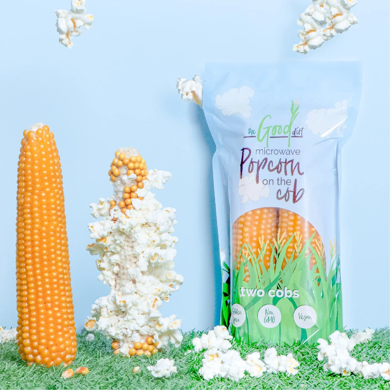
The Good Dirt - playful and engaging
Customers are increasingly concerned about the environmental impact of packaging, so packaging with a focus on sustainability, ie is made from eco-friendly materials and/or designed to be recyclable or reusable is definitely more likely to appeal. Your packaging design should include instructions and recommendations for recycling, reusing or disposal.
The Broth Sisters - natural and earthy
I take all these factors into consideration when designing food packaging and in addition I think about creativity, originality, and emotional appeal to make sure that your brand is the one that stands out on a busy shelf.
Remember the shopping list that the average consumer has in their head? My goal is for your product to be the one that catches a new customer’s eye and that they choose to put in their basket or trolley. Let’s work together to get your product on those lists!
Here at Blade Creative we can help you create packaging design that’s engaging, branded and encourages customers to buy. Check out some more examples of our packaging design here.


