Brand design for a community house
Godfrey Street Community House, is a well-loved local institution. They needed a proper, fully functional brand that could work across all digital and print media.
The Story
Despite being a long-established community landmark (it was founded in 1983), Godfrey Street Community House had never had a proper logo, simply an illustration of the house (and no practical file formats).
For this project, more than most, it was very important to engage and empathise with all stakeholders in the project (committee members and administrative employees). Part of my process was to visit Godfrey Street and see the venue and absorb its ambience.
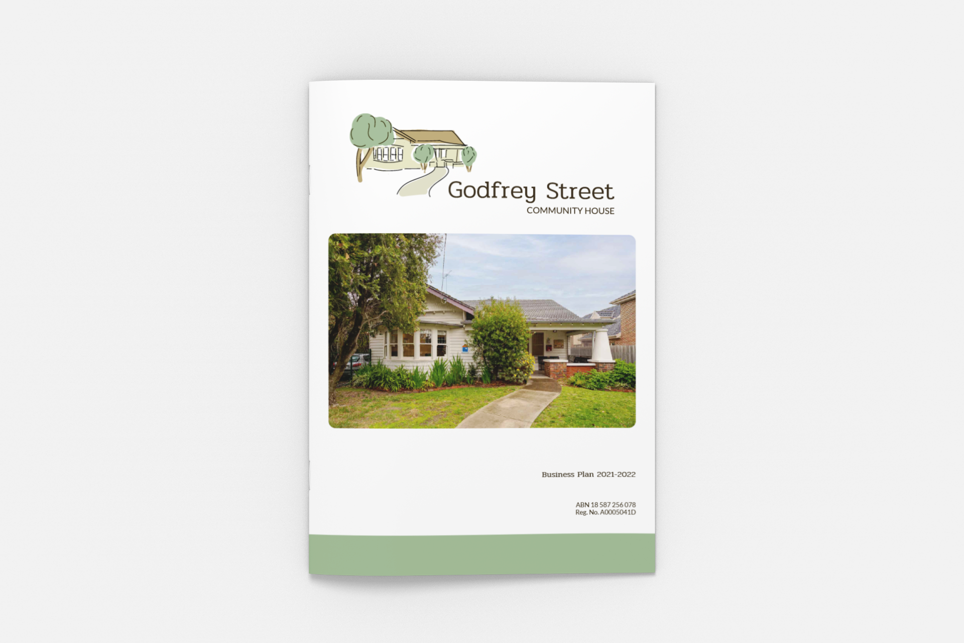
The brand design included a literal and illustration of the iconic house. It’s hand-drawn and deliberately ‘sketched’ in style. It uses soft, warm colours. The graphic and word mark can be used in different arrangements to allow maximum flexibility, and the full suite of logos includes stacked, horizontal and circular variations. It has been designed so as not to challenge the existing audience (existing members of Godfrey Street Community House) because it’s a clear representation of the institution they know and love. The design is warm and welcoming, but contemporary enough to engage a new and broader audience.
Services Provided
Brand strategy and design
Logo design - a full suite of logos and brand assets to use across all platforms and print
A comprehensive style guide
Creative collaboration with Webby Web Design
Signage design
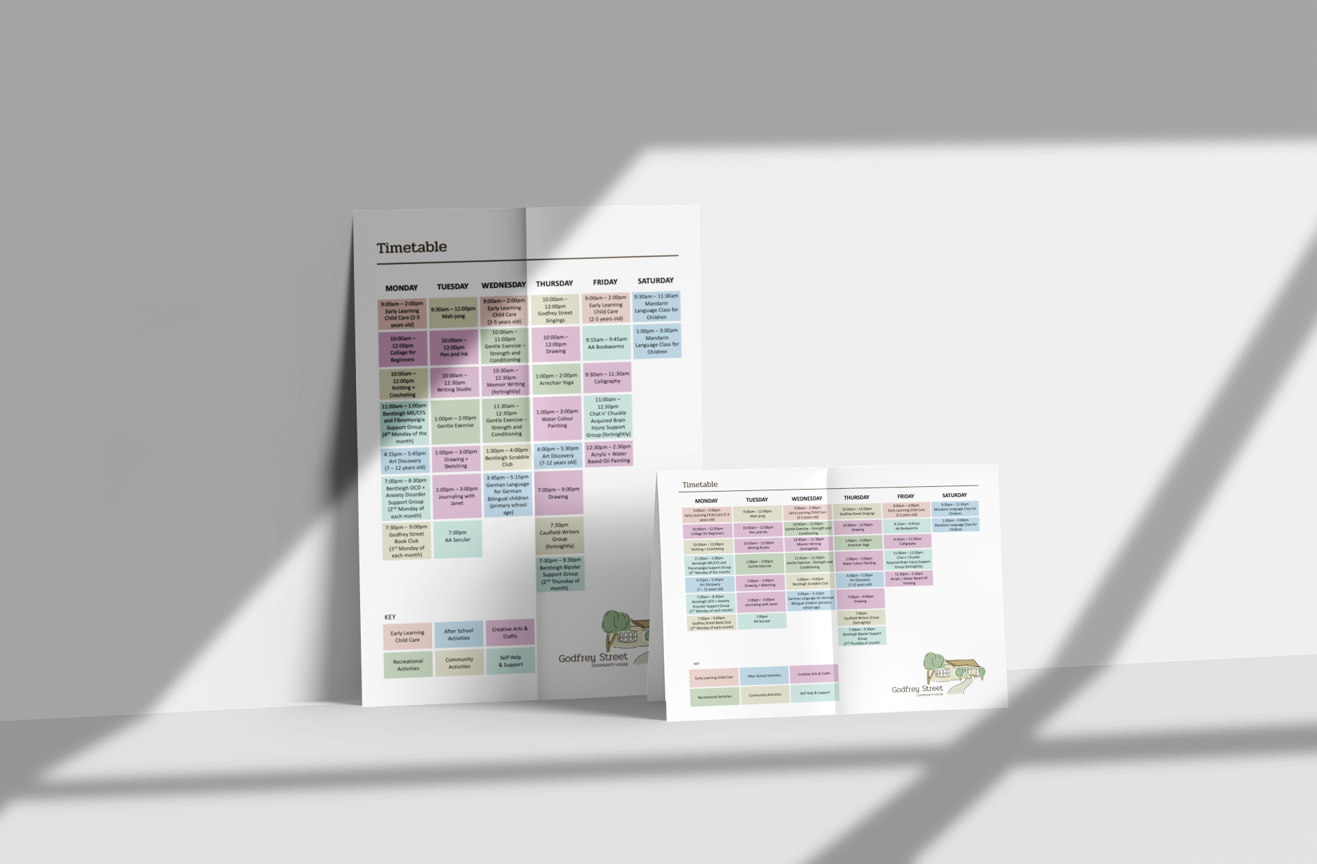
Creation of templates for the admin team at Godfrey Street to use to display timetables and semester brochures.
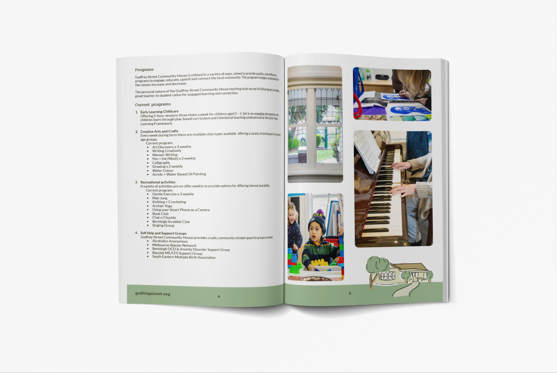
Business plan design and layout
“I worked with Clare at Blade Creative in the rebranding of Godfrey Street Community House. Clare was engaged, responsive and patient as we worked to find the right outcomes for our needs. She was easy to work with and had our best interests in mind at every stage.”
Allison Connell, via Google reviews
godfreystreet.org


